
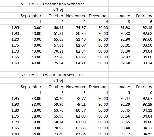
We present an alternative way of producing vaccination targets by starting with an initial target of 40% instead of 38%.
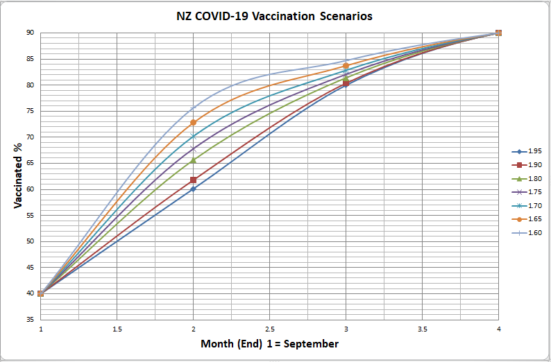
This time, for the top and bottom values for f, we compare the curves for 38% and 40%.
We obtain the following tables:
Notes:
September means at the end of September, . . .
Look at the top and bottom two lines in the tables.
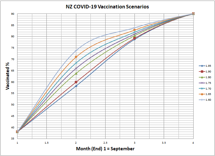
We graph the data in the top table.

Last time we had:
For the top two tables the curve becomes:

Recall: In the previous post the graph becomes (look at the top/highest curve):
The PDFs below will be easier to read:
Recall the original graph:
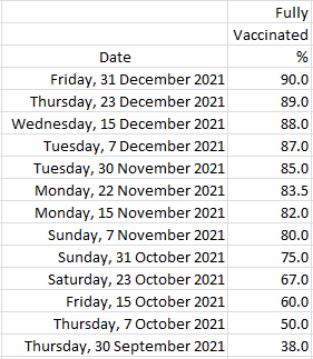
Here were are original targets:
For background see:

One Comment Add yours